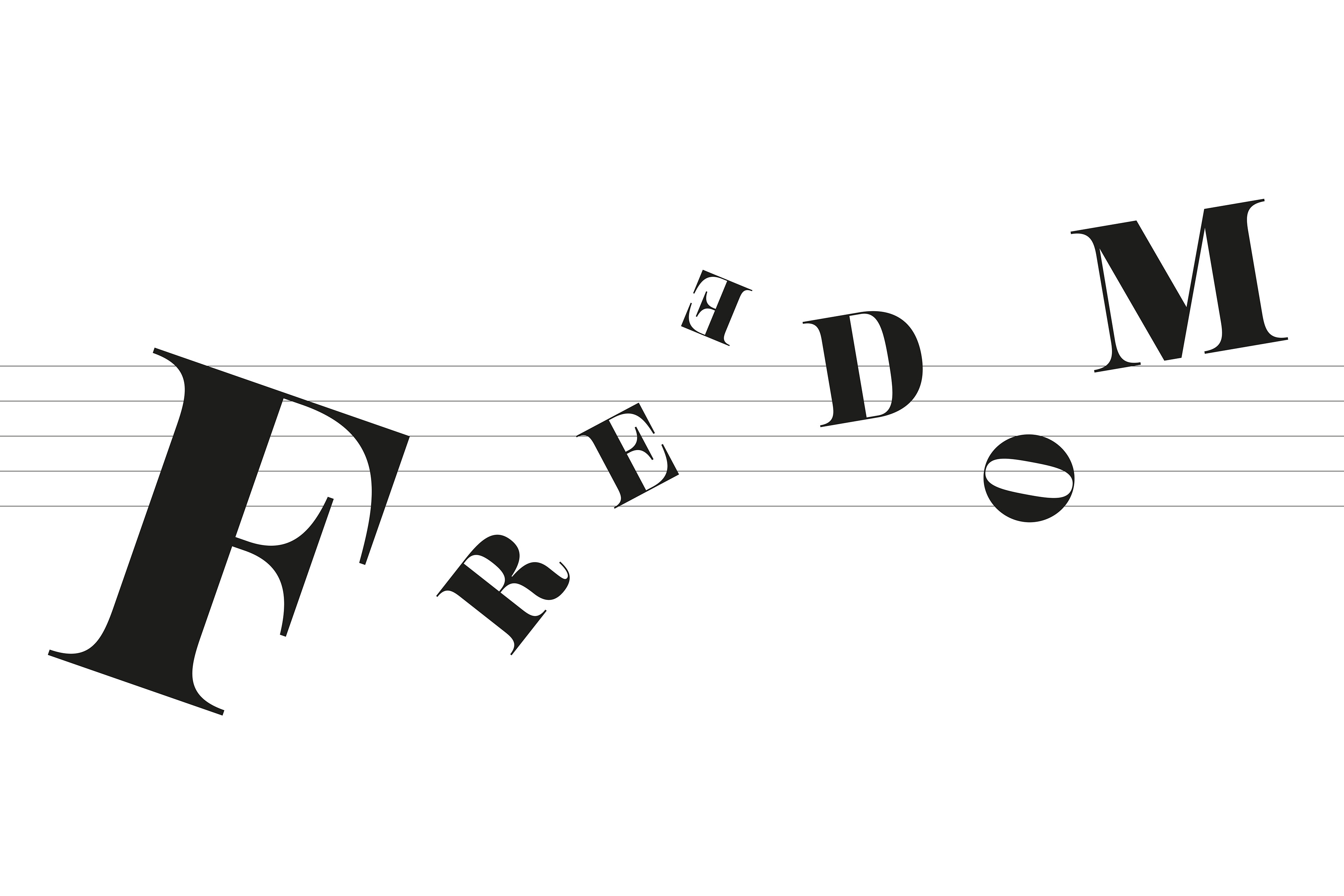
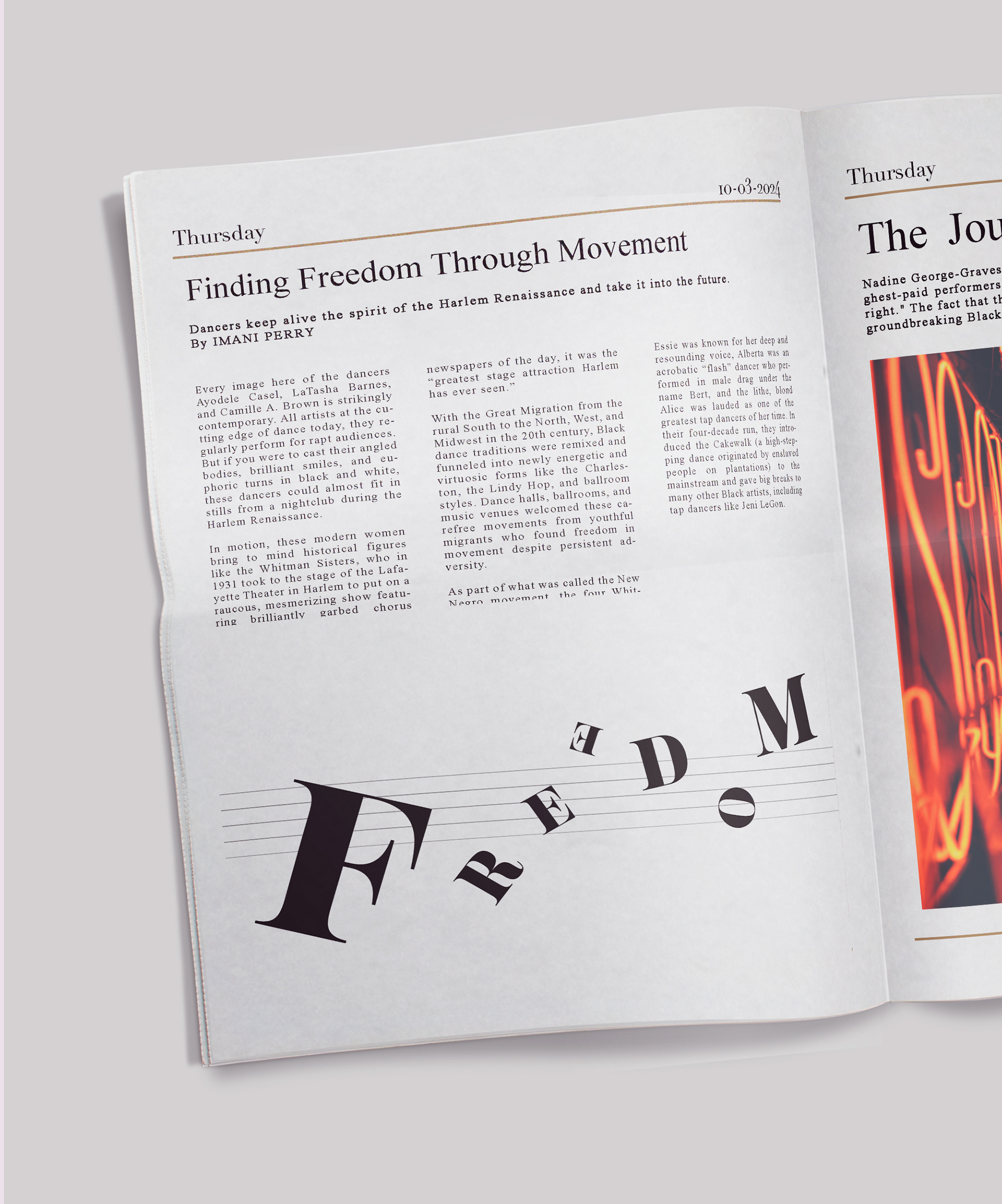

Designed an editorial ilustration for an article about the movements of female
dancers reviving Harlem Renaissance dance, using only typography without images.
The image needed to convey the idea of “Freedom” with a sense of rhythm like
dance while maintaining balance to appear as a single word. My goal was to create a
design that evokes both the jazz and dance of the Harlem Renaissance, alowing
viewers to feel a sense of freedom.
I began by exploring the meaning of the word “freedom.” I aimed to express freedom
using various elements such as position, rotation, and size. Through revisions and
iterations, I sought to reflect the historical context of the Harlem Renaissance by
drawing inspiration from jazz and adding five lines to resemble a musical staff. I
chose the bold yet rhythmic serif font NT Josefine to evoke a sense of rhythm.
\
The final work presents the word “Freedom” freely arranged on the musical staff
while maintaining a sense of rhythm. I experimented with various combinations of
size, rotation, and position to ensure the word appeared cohesive without losing its
flow. Although positioned on the staff, the typography does not feel restricted by it,
further emphasizing freedom. This approach communicates the movement and spirit
of the Harlem Renaissance in a thoughtful and rhythmic manner.