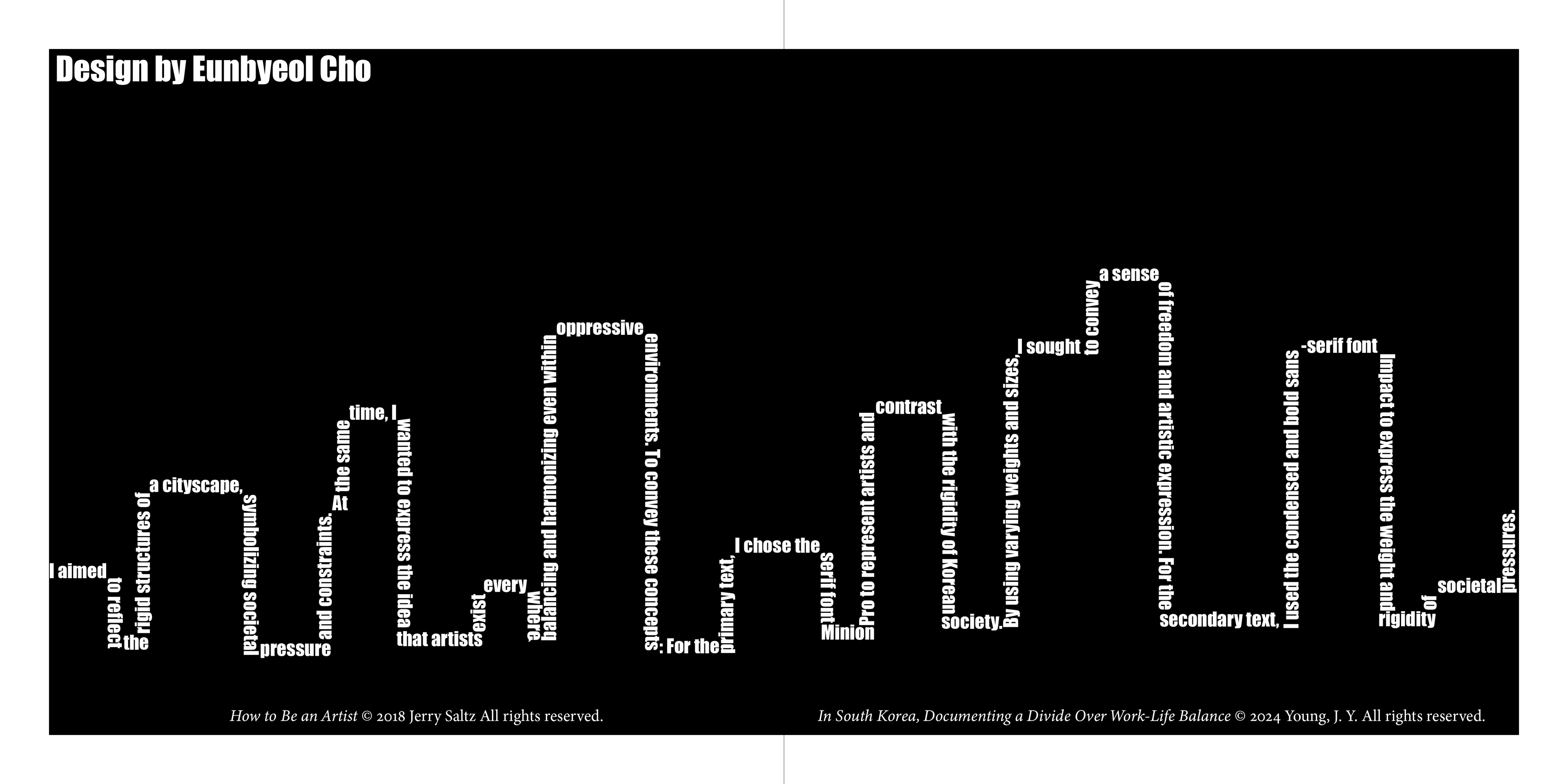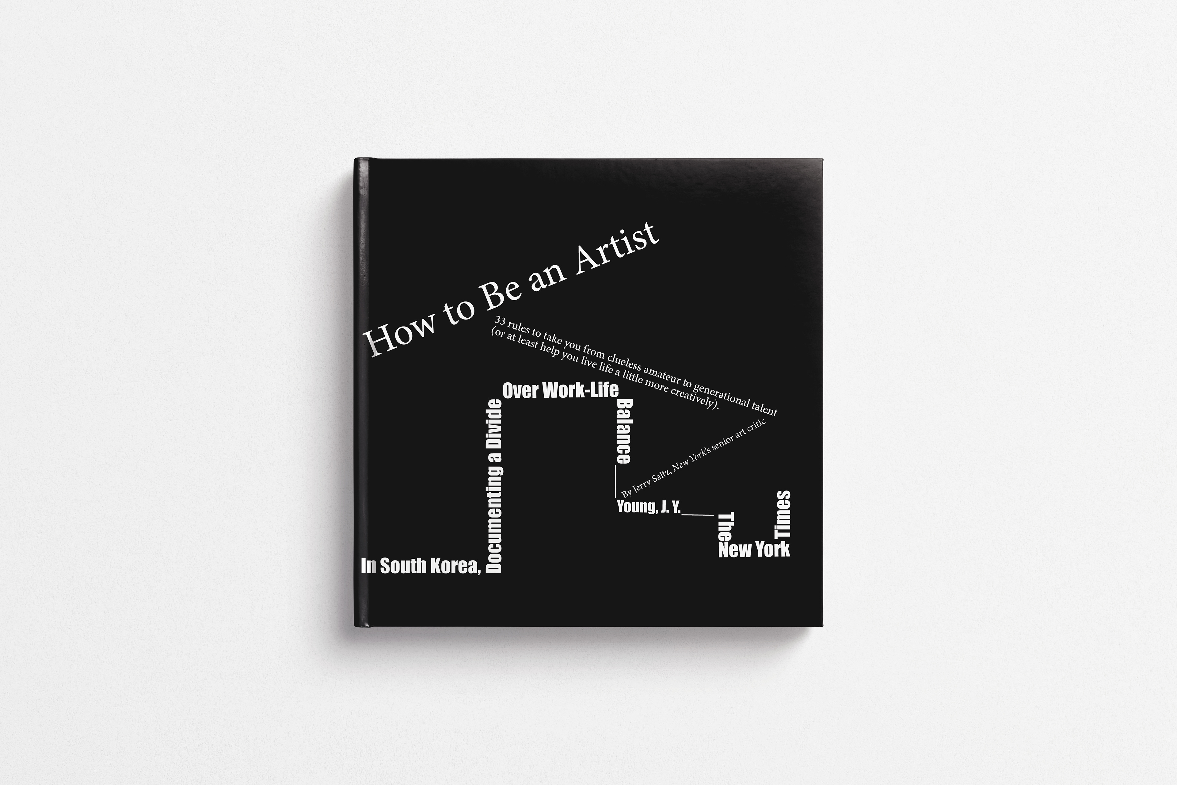
For this project, I focused on capturing the tension between personal creativity and
societal pressure, inspired by Jin Yu Young's article In South Korea, Documenting a
Divide Over Work-Life Balance and Jerry Saltz’s How to Be an Artist. I wanted the
design to reflect how creativity can thrive even under constraints. I chose Minion Pro, a
serif font, to represent individuality and artistic freedom, playing with different sizes and
weights to give it a sense of movement and expression. In contrast, I used Impact, a
bold and condensed sans-serif font, to symbolize the rigid and heavy expectations of
society. Through this balance, I aimed to show that even in structured, demanding
environments, artists find ways to create and express themselves.